入门
画布内界面是一棵实体树,根节点带有屏幕组件,定义界面所在空间。其下带元素组件的实体构成图像、文本和容纳其他元素的不可见组。按钮和滚动视图等组件进一步提供行为。本页介绍不同开发方式的配置,并构建一个包含标签和点击计数按钮的小面板。
配置
只要应用包含相应组件系统,就能绘制屏幕与元素。要响应输入,还需 ElementInput,将鼠标、触摸和 XR 输入转换为元素事件。
- 引擎
- 编辑器
- React
- Web Components
创建应用时,注册界面组件系统、字体与纹理处理器,以及 ElementInput:
const canvas = document.getElementById('application');
const device = await pc.createGraphicsDevice(canvas, {
    deviceTypes: [pc.DEVICETYPE_WEBGPU]
});

const options = new pc.AppOptions();
options.graphicsDevice = device;

// Create the ElementInput before the mouse and touch devices, so that calling
// stopPropagation() in a UI event handler also hides the event from them
options.elementInput = new pc.ElementInput(canvas);
options.mouse = new pc.Mouse(canvas);
options.touch = new pc.TouchDevice(canvas);

options.componentSystems = [
    pc.CameraComponentSystem,
    pc.ScreenComponentSystem,
    pc.ElementComponentSystem,
    pc.ButtonComponentSystem
];
options.resourceHandlers = [
    pc.FontHandler,
    pc.TextureHandler
];

const app = new pc.AppBase(canvas);
app.init(options);
app.setCanvasFillMode(pc.FILLMODE_FILL_WINDOW);
app.setCanvasResolution(pc.RESOLUTION_AUTO);
app.start();

window.addEventListener('resize', () => app.resizeCanvas());
使用其他界面组件时,再添加 pc.ScrollViewComponentSystem、pc.ScrollbarComponentSystem、pc.LayoutGroupComponentSystem 和 pc.LayoutChildComponentSystem。精灵还需要 pc.SpriteHandler 与 pc.TextureAtlasHandler。pc.Application 会注册所有系统和处理器,但同样不会自动创建 ElementInput,需要通过选项传入。其余配置详见独立使用引擎。
无需额外配置。启动和发布的应用会根据设置面板 INPUT 区域的鼠标与触摸设置创建 ElementInput。
编辑器视口中的界面不响应输入。请启动场景测试按钮和滚动视图。
无需额外配置。<Application> 会创建 ElementInput,以及鼠标和触摸设备。
无需额外配置。<pc-app> 会创建 ElementInput,以及鼠标和键盘设备。
第一个界面
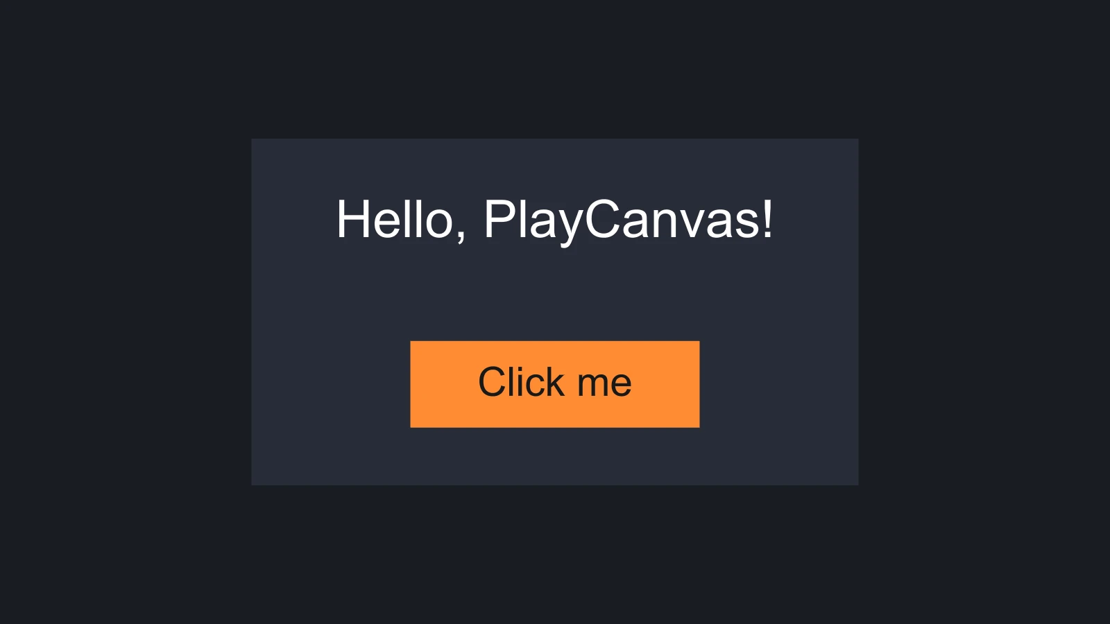
上图的界面由屏幕和面板组成,面板包含标签和按钮,按钮包含自己的文本。文本需要字体资源;本页代码加载名为 arial.json 的字体,可由任意字体文件生成。
- 引擎
- 编辑器
- React
- Web Components
按前述方法配置应用后:
// Load a font for the text
const font = new pc.Asset('arial', 'font', { url: 'fonts/arial.json' });
app.assets.add(font);
await new Promise((resolve) => {
    font.ready(resolve);
    app.assets.load(font);
});

const camera = new pc.Entity('camera');
camera.addComponent('camera', { clearColor: new pc.Color(0.1, 0.11, 0.13) });
app.root.addChild(camera);

// A screen-space screen that scales with the canvas
const screen = new pc.Entity('screen');
screen.addComponent('screen', {
    screenSpace: true,
    referenceResolution: [1280, 720],
    scaleMode: pc.SCALEMODE_BLEND,
    scaleBlend: 0.5
});
app.root.addChild(screen);

// A panel in the middle of the screen
const panel = new pc.Entity('panel');
panel.addComponent('element', {
    type: pc.ELEMENTTYPE_IMAGE,
    anchor: [0.5, 0.5, 0.5, 0.5],
    pivot: [0.5, 0.5],
    width: 420,
    height: 240,
    color: new pc.Color(0.16, 0.18, 0.23),
    opacity: 0.9
});
screen.addChild(panel);

// A label near the top of the panel
const label = new pc.Entity('label');
label.addComponent('element', {
    type: pc.ELEMENTTYPE_TEXT,
    fontAsset: font.id,
    text: 'Hello, PlayCanvas!',
    fontSize: 36,
    anchor: [0.5, 1, 0.5, 1],
    pivot: [0.5, 1]
});
label.setLocalPosition(0, -40, 0);
panel.addChild(label);

// A button near the bottom: an image element that receives input, and a
// button component that tints the image when it is hovered and pressed
const button = new pc.Entity('button');
button.addComponent('element', {
    type: pc.ELEMENTTYPE_IMAGE,
    anchor: [0.5, 0, 0.5, 0],
    pivot: [0.5, 0],
    width: 200,
    height: 60,
    color: new pc.Color(1, 0.55, 0.2),
    useInput: true
});
button.addComponent('button', {
    imageEntity: button,
    hoverTint: new pc.Color(1, 0.7, 0.45),
    pressedTint: new pc.Color(0.8, 0.4, 0.1)
});
button.setLocalPosition(0, 40, 0);
panel.addChild(button);

const buttonText = new pc.Entity('text');
buttonText.addComponent('element', {
    type: pc.ELEMENTTYPE_TEXT,
    fontAsset: font.id,
    text: 'Click me',
    fontSize: 28,
    color: new pc.Color(0.1, 0.1, 0.1),
    anchor: [0.5, 0.5, 0.5, 0.5],
    pivot: [0.5, 0.5]
});
button.addChild(buttonText);

// Count the clicks
let clicks = 0;
button.button.on('click', () => {
    clicks++;
    label.element.text = `Clicked ${clicks} times`;
});
-
上传
.ttf或.otf文件,创建字体资源。 -
在层级面板单击 +,选择 User Interface › 2D Screen。新实体会添加到选中实体下,因此下一步保持屏幕选中。
-
添加 User Interface › Image Element,重命名为
Panel。将 Element 的 Preset 设为 Center Anchor & Pivot,Width 为 420,Height 为 240,选择深色 Color,Opacity 设为 0.9。 -
选中面板,添加 User Interface › Text Element,重命名为
Label。将 Preset 设为 Top Anchor & Pivot,实体位置为 (0, -40, 0),Font 设为字体资源,Text 为Hello, PlayCanvas!,Font Size 为 36。 -
再次选中面板,添加 User Interface › Button。这会创建
Button实体及其Text子项,图像元素已启用 Use Input,按钮组件的 Image 已指向自身。将按钮 Preset 设为 Bottom Anchor & Pivot,位置为 (0, 40, 0),尺寸为 200 × 60,Color 为橙色,Hover Tint 与 Pressed Tint 分别为更浅、更深的橙色,子项 Text 设为Click me。 -
为
Button添加 Script 组件,挂载以下脚本,再将Label实体拖到 Label 属性:import { Entity, Script } from 'playcanvas';export class ClickCounter extends Script {static scriptName = 'clickCounter';/*** The text element that shows the count.** @attribute* @type {Entity}*/label;clicks = 0;initialize() {this.entity.button.on('click', () => {this.clicks++;this.label.element.text = `Clicked ${this.clicks} times`;});}} -
启动场景并单击按钮。
在 <Application> 内渲染 FirstInterface。@playcanvas/react 尚无 <Button> 组件,因此此处定义的 Button 会为所在实体添加引擎按钮组件。它将 props 原样传给引擎,所以颜色使用 Color 对象,而非 <Element> 接受的字符串:
import { useEffect, useRef, useState } from 'react';
import { Color } from 'playcanvas';
import { Entity } from '@playcanvas/react';
import { Camera, Element, Screen } from '@playcanvas/react/components';
import { useFont, useParent } from '@playcanvas/react/hooks';

function Button({ onClick, ...options }) {
  const entity = useParent();
  const handler = useRef(onClick);
  handler.current = onClick;

  useEffect(() => {
    entity.addComponent('button', { imageEntity: entity, ...options });
    const handle = entity.button.on('click', event => handler.current(event));
    return () => {
      handle.off();
      entity.removeComponent('button');
    };
  }, [entity]);

  return null;
}

export function FirstInterface() {
  const { asset: font } = useFont('fonts/arial.json');
  const [clicks, setClicks] = useState(0);
  if (!font) return null;

  return (
    <>
      <Entity name="camera">
        <Camera clearColor="#1a1c21" />
      </Entity>
      <Entity name="screen">
        <Screen referenceResolution={[1280, 720]} />
        <Entity name="panel">
          <Element type="image" anchor={[0.5, 0.5, 0.5, 0.5]} pivot={[0.5, 0.5]}
            width={420} height={240} color="#292e3b" opacity={0.9} />
          <Entity name="label" position={[0, -40, 0]}>
            <Element type="text" fontAsset={font} fontSize={36}
              text={clicks ? `Clicked ${clicks} times` : 'Hello, PlayCanvas!'}
              anchor={[0.5, 1, 0.5, 1]} pivot={[0.5, 1]} />
          </Entity>
          <Entity name="button" position={[0, 40, 0]}>
            <Element type="image" anchor={[0.5, 0, 0.5, 0]} pivot={[0.5, 0]}
              width={200} height={60} color="#ff8c33" useInput />
            <Button
              hoverTint={new Color(1, 0.7, 0.45)}
              pressedTint={new Color(0.8, 0.4, 0.1)}
              onClick={() => setClicks(c => c + 1)} />
            <Entity name="text">
              <Element type="text" fontAsset={font} text="Click me" fontSize={28}
                color="#1a1a1a" anchor={[0.5, 0.5, 0.5, 0.5]} pivot={[0.5, 0.5]} />
            </Entity>
          </Entity>
        </Entity>
      </Entity>
    </>
  );
}
<pc-app>
    <pc-asset id="arial" type="font" src="fonts/arial.json"></pc-asset>
    <pc-scene>
        <pc-entity name="camera">
            <pc-camera clear-color="#1a1c21"></pc-camera>
        </pc-entity>
        <pc-entity name="screen">
            <pc-screen screen-space scale-mode="blend" reference-resolution="1280 720"></pc-screen>
            <pc-entity name="panel">
                <pc-element type="image" anchor="0.5 0.5 0.5 0.5" pivot="0.5 0.5"
                            width="420" height="240" color="#292e3b" opacity="0.9"></pc-element>
                <pc-entity name="label" position="0 -40 0">
                    <pc-element type="text" font-asset="arial" font-size="36" text="Hello, PlayCanvas!"
                                anchor="0.5 1 0.5 1" pivot="0.5 1"></pc-element>
                </pc-entity>
                <pc-entity name="button" position="0 40 0">
                    <pc-element type="image" anchor="0.5 0 0.5 0" pivot="0.5 0"
                                width="200" height="60" color="#ff8c33" use-input></pc-element>
                    <pc-button hover-tint="1 0.7 0.45" pressed-tint="0.8 0.4 0.1"></pc-button>
                    <pc-entity name="text">
                        <pc-element type="text" font-asset="arial" text="Click me" font-size="28"
                                    color="#1a1a1a" anchor="0.5 0.5 0.5 0.5" pivot="0.5 0.5"></pc-element>
                    </pc-entity>
                </pc-entity>
            </pc-entity>
        </pc-entity>
    </pc-scene>
</pc-app>

<script type="module">
    import { whenReady } from '@playcanvas/web-components';

    // Count the clicks
    const button = await whenReady('pc-button');
    const label = document.querySelector('pc-entity[name="label"] > pc-element');
    let clicks = 0;
    button.component.on('click', () => {
        clicks++;
        label.setAttribute('text', `Clicked ${clicks} times`);
    });
</script>
组合关系
上述界面的实体树如下:
screen          屏幕组件:根节点,定义界面所在空间
└── panel       图像元素
    ├── label   文本元素
    └── button  接收输入的图像元素,并带按钮组件
        └── text  文本元素
由此可得以下规则,本章其余内容都建立在这些规则之上:
- 元素按屏幕单位布局。 对于本例这种会缩放的屏幕空间界面,一个单位对应 1280 × 720 参考分辨率下的一个像素,全部内容随画布缩放。详见屏幕。
- 子项相对父项定位。 锚点选择父项上的点或边,轴心选择元素自身放在该位置的点。标签锚定面板顶部,因此面板移动或改尺寸时,标签也随之变化。Y 轴向上,详见元素。
- 层级决定绘制顺序。 父项先于子项绘制,较早的同级项先于后面的同级项,因此按钮文本会显示在按钮之上。详见绘制顺序与性能。
- 只有启用输入的元素才会接收输入。 按钮图像启用了
useInput,事件会向祖先冒泡,详见输入。
不同开发方式的命名
所有方式操作相同组件,同一属性具有四种书写形式:
| 开发方式 | 风格 | 示例 |
|---|---|---|
| 引擎 | camelCase 属性。向量和颜色使用 pc.Vec2、pc.Vec4、pc.Color 对象,传给 addComponent 时也可用数组 | fontSize: 36, anchor: [0.5, 1, 0.5, 1] |
| 编辑器 | 检查器字段采用单词首字母大写 | Font Size、Anchor |
| React | camelCase props,向量使用数组,颜色使用 CSS 颜色字符串 | fontSize={36}, anchor={[0.5, 1, 0.5, 1]}, color="#ff8c33" |
| Web Components | kebab-case 属性,向量使用空格分隔的数字 | font-size="36", anchor="0.5 1 0.5 1" |
少数属性没有对应的 React prop 或 Web Components attribute。例如,React 保留了 key,<pc-element> 也没有 layers 和 rect 属性。这时应直接设置引擎组件:React 中通过 useParent() 或 <Entity ref> 获取实体;Web Components 中等待 whenReady 完成,再使用元素的 component 属性。
默认值有所不同
组件默认值来自引擎,但 React 会修改部分默认值,因此不传选项时,不同方式创建的屏幕或元素可能表现不同:
| 引擎 | React | Web Components | |
|---|---|---|---|
| 无选项的屏幕 | 世界空间,Scale Mode 为 None,640 × 320 | 屏幕空间,Scale Mode 为 Blend,参考分辨率 1280 × 720 | 世界空间,Scale Mode 为 None,640 × 320 |
| 元素锚点和轴心 | 左下角:0, 0, 0, 0 和 0, 0 | 左下角 | 左下角 |
| 元素尺寸 | 32 × 32 | 32 × 32 | 32 × 32 |
| 输入设备 | 传给 AppOptions 的设备 | 鼠标、触摸和元素输入 | 鼠标、键盘和元素输入 |
请像本页示例一样,显式设置所依赖的属性。编辑器检查器会显示新实体的全部值,可以在那里核对。
另请参阅
- 屏幕:屏幕空间、世界空间及适应画布的缩放。
- 元素:通过锚点、轴心和边距定位及调整尺寸。
- 输入:事件、冒泡及防止界面点击传入游戏。
- 用户界面:按钮:在编辑器中构建按钮的教程。
- Screen 组件、
<pc-screen>和 ScreenComponent:全部屏幕属性参考。