安全区域
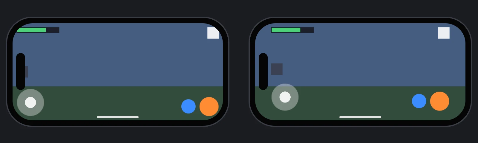
很多手机的屏幕局部会被刘海、摄像头开孔、圆角或底部主屏幕指示条遮挡。浏览器通过四个 CSS 环境变量描述其余的安全区域:safe-area-inset-top、safe-area-inset-right、safe-area-inset-bottom 和 safe-area-inset-left,表示页面各边可能被遮挡的 CSS 像素距离。画布内界面不会自动读取它们,因此需要代码获取,并将关键内容放在范围内。
让页面延伸至边缘
默认情况下,浏览器会自行让页面避开遮挡区域,例如横屏两侧留空,并报告 0 边距。要使用整个屏幕,需要在 viewport meta 标签中指定 viewport-fit=cover:
<meta name="viewport" content="width=device-width, initial-scale=1, viewport-fit=cover">
编辑器发布的应用已包含此设置,自行编写页面时需要添加。
读取边距
环境变量仅供 CSS 使用,因此可通过带相应 padding 的元素读取:
// Read the safe-area insets, in CSS pixels, from an element padded with them
function readSafeAreaInsets() {
    const probe = document.createElement('div');
    probe.style.cssText = 'position: fixed; visibility: hidden; pointer-events: none; ' +
        'padding: env(safe-area-inset-top) env(safe-area-inset-right) env(safe-area-inset-bottom) env(safe-area-inset-left);';
    document.body.appendChild(probe);
    const style = getComputedStyle(probe);
    const insets = {
        top: parseFloat(style.paddingTop),
        right: parseFloat(style.paddingRight),
        bottom: parseFloat(style.paddingBottom),
        left: parseFloat(style.paddingLeft)
    };
    probe.remove();
    return insets;
}
手机旋转后边距会变化,应在画布尺寸改变时重新读取。
将界面保持在区域内
将分数、按钮和菜单等关键内容放到填满屏幕的组元素下,并将组边距设为安全边距。它们相对组而非屏幕锚定后,就会保持在安全区域内;仍锚定到屏幕的背景和装饰则可延伸到边缘。
安全边距使用 CSS 像素,而元素边距使用屏幕单位。屏幕空间中,一个 CSS 像素等于 canvas.width / canvas.clientWidth 个绘制缓冲像素,一个屏幕单位等于 scale 个绘制缓冲像素,详见屏幕。以下示例假设画布填满页面,因为安全边距从页面边缘测量:
- 引擎
- 编辑器
- React
- Web Components
// A group that fills the screen, for everything that must stay in the safe area
const safeArea = new pc.Entity('safe area');
safeArea.addComponent('element', {
    type: pc.ELEMENTTYPE_GROUP,
    anchor: [0, 0, 1, 1],
    margin: [0, 0, 0, 0]
});
screen.addChild(safeArea);

// Anchored to the group, the pause button stays inside the safe area
const pauseButton = new pc.Entity('pause button');
pauseButton.addComponent('element', {
    type: pc.ELEMENTTYPE_IMAGE,
    anchor: [1, 1, 1, 1],
    pivot: [1, 1],
    width: 80,
    height: 80,
    useInput: true
});
safeArea.addChild(pauseButton);
pauseButton.setLocalPosition(-20, -20, 0);

const applySafeArea = () => {
    const insets = readSafeAreaInsets();
    const canvas = app.graphicsDevice.canvas;
    const units = (canvas.width / canvas.clientWidth) / screen.screen.scale;
    safeArea.element.margin = new pc.Vec4(
        insets.left * units,
        insets.bottom * units,
        insets.right * units,
        insets.top * units
    );
};
applySafeArea();
app.graphicsDevice.on('resizecanvas', () => applySafeArea());
在 2D Screen 下添加 User Interface › Group Element,将 Preset 设为 Stretch。添加 Script 组件并挂载以下脚本,同时将读取边距中的 readSafeAreaInsets 放入同一文件:
import { Script, Vec4 } from 'playcanvas';

export class SafeArea extends Script {
    static scriptName = 'safeArea';

    initialize() {
        this.apply();
        this.app.graphicsDevice.on('resizecanvas', this.apply, this);
        this.once('destroy', () => {
            this.app.graphicsDevice.off('resizecanvas', this.apply, this);
        });
    }

    apply() {
        const insets = readSafeAreaInsets();
        const canvas = this.app.graphicsDevice.canvas;
        const units = (canvas.width / canvas.clientWidth) / this.entity.element.screen.screen.scale;
        this.entity.element.margin = new Vec4(
            insets.left * units,
            insets.bottom * units,
            insets.right * units,
            insets.top * units
        );
    }
}
将必须位于安全区域内的元素移到该组下。
SafeArea 是填满屏幕并减去安全边距的组,使用读取边距中的 readSafeAreaInsets。将其直接放到屏幕 <Entity> 内,再将关键元素放到它里面:
import { useEffect, useState } from 'react';
import { Entity } from '@playcanvas/react';
import { Element, Screen } from '@playcanvas/react/components';
import { useApp, useParent } from '@playcanvas/react/hooks';

export function SafeArea({ children }) {
  const app = useApp();
  const screen = useParent();
  const [margin, setMargin] = useState([0, 0, 0, 0]);

  useEffect(() => {
    const device = app.graphicsDevice;
    const apply = () => {
      const insets = readSafeAreaInsets();
      const units = (device.canvas.width / device.canvas.clientWidth) / screen.screen.scale;
      setMargin([insets.left * units, insets.bottom * units, insets.right * units, insets.top * units]);
    };
    apply();
    device.on('resizecanvas', apply);
    return () => device.off('resizecanvas', apply);
  }, [app, screen]);

  return (
    <Entity name="safe area">
      <Element type="group" anchor={[0, 0, 1, 1]} margin={margin} />
      {children}
    </Entity>
  );
}

export function Hud() {
  return (
    <Entity name="screen">
      <Screen referenceResolution={[1280, 720]} />
      <SafeArea>
        <Entity name="pause button" position={[-20, -20, 0]}>
          <Element type="image" anchor={[1, 1, 1, 1]} pivot={[1, 1]} width={80} height={80} useInput />
        </Entity>
      </SafeArea>
    </Entity>
  );
}
<pc-entity name="screen">
    <pc-screen screen-space scale-mode="blend" reference-resolution="1280 720"></pc-screen>
    <pc-entity name="safe area">
        <pc-element id="safe-area" type="group" anchor="0 0 1 1" margin="0 0 0 0"></pc-element>
        <pc-entity name="pause button" position="-20 -20 0">
            <pc-element type="image" anchor="1 1 1 1" pivot="1 1" width="80" height="80" use-input></pc-element>
        </pc-entity>
    </pc-entity>
</pc-entity>

<script type="module">
    import { whenReady } from '@playcanvas/web-components';

    const { app } = await whenReady('pc-app');
    const screen = await whenReady('pc-screen');
    const safeArea = await whenReady('#safe-area');

    const apply = () => {
        const insets = readSafeAreaInsets();
        const canvas = app.graphicsDevice.canvas;
        const units = (canvas.width / canvas.clientWidth) / screen.component.scale;
        const margin = [insets.left, insets.bottom, insets.right, insets.top].map(inset => inset * units);
        safeArea.setAttribute('margin', margin.join(' '));
    };
    apply();
    app.graphicsDevice.on('resizecanvas', apply);
</script>
在同一脚本中定义读取边距中的 readSafeAreaInsets。
HTML 与 CSS 界面可直接使用环境变量,例如在根元素设置 padding: env(safe-area-inset-top) env(safe-area-inset-right) env(safe-area-inset-bottom) env(safe-area-inset-left)。
没有手机时如何测试
桌面浏览器报告 0 边距。测试布局时,可让 readSafeAreaInsets 返回测试值,例如模拟左侧有开孔的横屏手机:
// Test values in place of the real insets: remove before publishing
function readSafeAreaInsets() {
    return { top: 0, right: 47, bottom: 21, left: 47 };
}
没有手机但希望测试真实边距时,可使用 Xcode 自带的 iOS Simulator 等设备模拟器。
另请参阅
- 屏幕:缩放并适配任意画布。
- HTML 与 CSS:DOM 界面。
- 移动界面安全区域:带可复用安全区域脚本的编辑器项目。
env():MDN 的 CSS 环境变量文档。