布局组
布局组自动定位和调整子元素尺寸,支持单行、单列和换行形成的网格。适用于列表、工具栏、菜单、背包等需要在添加、移除和改尺寸时保持整齐排列的内容。
创建布局组
布局组组件与 Element 位于同一实体上,通常搭配组元素,其矩形就是布局空间。以下列表从上到下堆叠五行,并将各行拉伸到列表宽度:
- 引擎
- 编辑器
- React
- Web Components
const list = new pc.Entity('list');
list.addComponent('element', {
    type: pc.ELEMENTTYPE_GROUP,
    anchor: [0.5, 0.5, 0.5, 0.5],
    pivot: [0.5, 0.5],
    width: 300,
    height: 400
});
list.addComponent('layoutgroup', {
    orientation: pc.ORIENTATION_VERTICAL,
    spacing: [0, 10],
    padding: [10, 10, 10, 10],
    widthFitting: pc.FITTING_STRETCH
});
screen.addChild(list);

for (let i = 0; i < 5; i++) {
    const row = new pc.Entity(`row ${i}`);
    row.addComponent('element', {
        type: pc.ELEMENTTYPE_IMAGE,
        height: 60,
        color: new pc.Color(0.23, 0.55, 1)
    });
    list.addChild(row);
}
创建应用时注册 pc.LayoutGroupComponentSystem 和 pc.LayoutChildComponentSystem。即使没有子项使用 LayoutChild,布局组也需要其系统。
在层级选择 + › User Interface › Layout Group,创建带布局组组件的组元素。已有元素则可在检查器选择 Add Component › UI › Layout Group。将子项加在其下,设置 Orientation 为 Vertical、Spacing 为 0 和 10、四边 Padding 为 10、Width Fitting 为 Stretch。
目前尚无 <LayoutGroup> 组件,因此这里的 LayoutGroup 辅助组件会为所在实体添加引擎布局组:
import { useEffect } from 'react';
import { FITTING_STRETCH, ORIENTATION_VERTICAL } from 'playcanvas';
import { Entity } from '@playcanvas/react';
import { Element } from '@playcanvas/react/components';
import { useParent } from '@playcanvas/react/hooks';

// Adds a layout group with the given options when it mounts
function LayoutGroup(options) {
  const entity = useParent();
  useEffect(() => {
    entity.addComponent('layoutgroup', options);
    return () => entity.removeComponent('layoutgroup');
  }, [entity]);
  return null;
}

export function List({ items }) {
  return (
    <Entity name="list">
      <Element type="group" anchor={[0.5, 0.5, 0.5, 0.5]} pivot={[0.5, 0.5]} width={300} height={400} />
      <LayoutGroup orientation={ORIENTATION_VERTICAL} spacing={[0, 10]}
        padding={[10, 10, 10, 10]} widthFitting={FITTING_STRETCH} />
      {items.map(item => (
        <Entity key={item.id} name={item.name}>
          <Element type="image" height={60} color="#3a8cff" />
        </Entity>
      ))}
    </Entity>
  );
}
行的位置由布局组管理,因此不要为它们的 <Entity> 指定 position。
<Entity> 始终将新实体加到已有同级项之后,与 JSX 位置无关,因此插入 items 中部的行也会排在末尾。若支持插入或排序,可为列表设置随顺序变化的 key,例如 key={items.map(item => item.id).join()},让它按新顺序重建。
<pc-entity name="list">
    <pc-element type="group" anchor="0.5 0.5 0.5 0.5" pivot="0.5 0.5" width="300" height="400"></pc-element>
    <pc-layout-group orientation="vertical" spacing="0 10" padding="10 10 10 10" width-fitting="stretch"></pc-layout-group>
    <pc-entity name="row 0">
        <pc-element type="image" height="60" color="#3a8cff"></pc-element>
    </pc-entity>
    <pc-entity name="row 1">
        <pc-element type="image" height="60" color="#3a8cff"></pc-element>
    </pc-entity>
    <pc-entity name="row 2">
        <pc-element type="image" height="60" color="#3a8cff"></pc-element>
    </pc-entity>
    <pc-entity name="row 3">
        <pc-element type="image" height="60" color="#3a8cff"></pc-element>
    </pc-entity>
    <pc-entity name="row 4">
        <pc-element type="image" height="60" color="#3a8cff"></pc-element>
    </pc-entity>
</pc-entity>
子项放置规则
布局组按层级顺序排列启用且具有已启用 Element 的直接子项,对各子项执行:
- 设置锚点为组左下角
0, 0, 0, 0。子项原有锚点,无论是否分离,都会被替换。 - 设置位置。 根据子项轴心放置矩形,使不同轴心下矩形仍处于相同位置。
- 设置计算尺寸。 适配或 LayoutChild 改变尺寸时,子项
width和height仍保留设置值,作为起始尺寸;实际值详见宽度与高度。
更深层后代不受影响,因此各子项可以容纳自己的内容,甚至独立布局组。嵌套布局组从外向内布局。
子项添加、移除、启用、禁用、改尺寸或轴心变化,以及布局组属性变化时,会在同一帧稍后、绘制前重新布局。手动移动子项不会触发布局,下次布局会将其移回。每次布局后会触发带子项边界的 reflow:
list.layoutgroup.on('reflow', ({ bounds }) => {
    // bounds.x and bounds.y are the bottom-left corner of the children, relative to the
    // bottom-left corner of the group, and bounds.z and bounds.w are their width and height
    console.log(`The children take up ${bounds.z} × ${bounds.w}`);
});
布局组属性
方向
Horizontal 从左到右排成行,Vertical 从上到下排成列。
反转
Reverse X 和 Reverse Y 反转各轴顺序。默认启用 Reverse Y,使列和网格行从上到下排列。关闭可从底部向上,启用 Reverse X 可从右向左。
对齐
Alignment 决定未填满组时,子项整体的位置,从左下 0, 0 到右上 1, 1。默认 0, 1 为左上。网格中还控制每行对齐,因此 0.5, 1 可使不足一整行的末行居中。
内边距
Padding 为组边缘内部保留空间,顺序为左、下、右、上。
间距
Spacing 为相邻子项间隙。X 是同行子项间距,Y 是同列子项及网格行之间的间距。
尺寸适配
Width Fitting 和 Height Fitting 决定是否调整子项尺寸以适应组:
| 适配模式 | 子项行为 |
|---|---|
| None | 保持自身尺寸 |
| Stretch | 小于组时扩展填满,但不超过最大尺寸 |
| Shrink | 大于组时缩小,但不低于最小尺寸 |
| Both | 按需要拉伸或收缩 |
沿布局方向,例如一行的宽度,空余空间或溢出量在子项之间分摊,默认均分,可由布局子项指定不同权重。垂直于布局方向,各子项独立适应所在行高或列宽。引擎常量为 pc.FITTING_NONE、pc.FITTING_STRETCH、pc.FITTING_SHRINK 和 pc.FITTING_BOTH。
换行
启用 Wrap 后,超出行宽的子项移到新行,形成网格。组宽决定每行数量:三个宽 100、间距 10 的子项,至少需要 320 宽。垂直布局则由组高决定每列数量。
布局子项
为布局组子项添加 LayoutChild,可改变其尺寸分配:
| 属性 | 效果 |
|---|---|
| Min Width、Min Height | 布局允许的最小尺寸 |
| Max Width、Max Height | 布局允许的最大尺寸,留空表示无限制 |
| Fit Width Proportion、Fit Height Proportion | 拉伸或收缩时的空间分配权重。拉伸时,权重 2 获得权重 1 两倍的额外空间;收缩时,权重越大,缩减越少。例如两个宽 100、权重分别为 2 和 1 的子项缩入 140 单位后,宽度为 80 和 60 |
| Exclude from Layout | 排除该子项,保留自己的锚点和位置 |
例如,工具栏按钮横向拉满时,可用最大宽度限制其中一个继续变大:
- 引擎
- 编辑器
- React
- Web Components
button.addComponent('layoutchild', {
    maxWidth: 120
});
选中按钮,在检查器选择 Add Component › UI › Layout Child,将 Max Width 设为 120。层级 + › User Interface › Layout Child 则会新建带该组件的组元素。
LayoutChild 与上面的 LayoutGroup 辅助组件原理相同:
function LayoutChild(options) {
  const entity = useParent();
  useEffect(() => {
    entity.addComponent('layoutchild', options);
    return () => entity.removeComponent('layoutchild');
  }, [entity]);
  return null;
}

<Entity name="button">
  <Element type="image" width={100} height={60} useInput />
  <LayoutChild maxWidth={120} />
</Entity>
<pc-entity name="button">
    <pc-element type="image" width="100" height="60" use-input></pc-element>
    <pc-layout-child max-width="120"></pc-layout-child>
</pc-entity>
布局示例
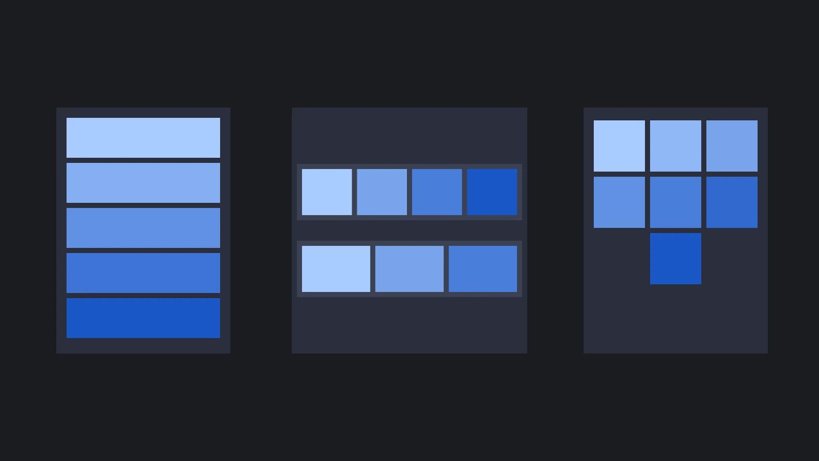
本页顶部图中的布局使用以下属性:
| 属性 | 垂直列表 | 工具栏 | 网格 |
|---|---|---|---|
| Orientation | Vertical(垂直) | Horizontal(水平) | Horizontal(水平) |
| Alignment | 0, 1 | 0, 0.5 | 0.5, 1 |
| Padding | 10, 10, 10, 10 | 10, 10, 10, 10 | 0, 0, 0, 0 |
| Spacing | 0, 10 | 10, 0 | 10, 10 |
| Width Fitting | Stretch(拉伸) | Stretch(拉伸) | None(无) |
| Height Fitting | None(无) | Stretch(拉伸) | None(无) |
| Wrap | 关闭 | 关闭 | 开启 |
- 垂直列表。 各行只设置高度,Width Fitting 将宽度拉伸到列表宽减内边距,适合排行榜和设置菜单。
- 工具栏。 两轴拉伸,将工具栏宽度均分给按钮,并使高度适应内边距后的空间,按钮增减时仍保持均匀。
- 网格。 子项为 100 单位方形,组宽 320,每行可放三个。
0.5, 1使网格从顶部开始,且每行居中,包括不足一整行的末行。
运行时修改布局
修改布局组属性会重新排列子项。向量属性需要赋予新的向量对象:
list.layoutgroup.spacing = new pc.Vec2(0, 20);
list.layoutgroup.padding = new pc.Vec4(20, 20, 20, 20);
list.layoutgroup.wrap = true;
添加、移除、启用和禁用子项也会重新布局,因此列表会随条目增加而增长:
const row = new pc.Entity('row');
row.addComponent('element', {
    type: pc.ELEMENTTYPE_IMAGE,
    height: 60
});
list.addChild(row);
布局组不会自动调整自身元素尺寸以容纳子项。要让滚动视图内容适应列表,应使用 reflow 返回的边界。
另请参阅
- 元素:锚点、轴心和组元素。
- 滚动视图:滚动比视口更长的列表。
- Layout Group 组件、
<pc-layout-group>和 LayoutGroupComponent:全部布局组属性参考。 - Layout Child 组件、
<pc-layout-child>和 LayoutChildComponent:全部布局子项属性参考。