图像元素
图像元素绘制一个矩形,可以显示纯色、纹理或精灵的一帧。面板、背景、图标、按钮和遮罩都属于图像元素。
颜色与不透明度
color 对图像染色,与纹理颜色相乘,因此白色或灰度纹理可显示为任意颜色;没有纹理时则显示对应纯色矩形。opacity 在 0 到 1 之间控制不透明度。color 的 Alpha 会被忽略,请使用 opacity。
通过代码修改时,赋予新的 pc.Color:
panel.element.color = new pc.Color(0.23, 0.55, 1);
panel.element.opacity = 0.8;
元素颜色和不透明度不影响子项,详见组元素。
纹理
为图像元素指定纹理资源即可显示图片:
- 引擎
- 编辑器
- React
- Web Components
const icon = new pc.Entity('icon');
icon.addComponent('element', {
    type: pc.ELEMENTTYPE_IMAGE,
    anchor: [0.5, 0.5, 0.5, 0.5],
    pivot: [0.5, 0.5],
    width: 128,
    height: 128,
    textureAsset: iconTexture.id
});
screen.addChild(icon);
iconTexture 是已添加到 app.assets 并加载的纹理资源。若使用 pc.Texture 对象,则设置 texture。
将纹理资源拖到图像元素的 Texture 字段。
import { Entity } from '@playcanvas/react';
import { Element } from '@playcanvas/react/components';
import { useTexture } from '@playcanvas/react/hooks';

export function Icon() {
  const { asset: texture } = useTexture('textures/icon.png');
  if (!texture) return null;

  return (
    <Entity name="icon">
      <Element type="image" anchor={[0.5, 0.5, 0.5, 0.5]} pivot={[0.5, 0.5]}
        width={128} height={128} textureAsset={texture} />
    </Entity>
  );
}
<pc-asset id="icon" src="textures/icon.png"></pc-asset>

<pc-entity name="icon">
    <pc-element type="image" anchor="0.5 0.5 0.5 0.5" pivot="0.5 0.5"
                width="128" height="128" texture-asset="icon"></pc-element>
</pc-entity>
在 <pc-app> 内声明 <pc-asset>,将 <pc-entity> 放到屏幕下。
图像只能显示纹理或精灵中的一种。分配纹理资源会清除精灵资源,分配精灵则会清除纹理。
适配纹理
默认将纹理拉伸到元素形状以填满区域。Fit Mode 可改为保持宽高比:
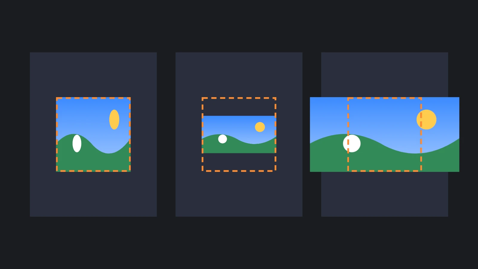
| 适配模式 | 纹理行为 |
|---|---|
| Stretch | 拉伸填满元素,默认模式 |
| Contain | 缩放至完整容纳于元素内,在两侧或上下留白 |
| Cover | 缩放至覆盖元素,多余部分溢出两侧或上下,可用遮罩裁切 |
Contain 和 Cover 根据元素轴心定位:居中轴心使图像居中,角落轴心使图像对齐相应角落。引擎中将 fitMode 设为 pc.FITMODE_STRETCH、pc.FITMODE_CONTAIN 或 pc.FITMODE_COVER;React 使用 fitMode prop,Web Components 使用 fit-mode 属性。
显示部分纹理
rect 以纹理比例指定要绘制区域的 U、V、宽、高,从左下角 0, 0 开始。默认 0, 0, 1, 1 显示整张纹理:
// The top-left quarter of the texture
icon.element.rect = new pc.Vec4(0, 0.5, 0.5, 0.5);
如果同一纹理打包了很多图像,使用纹理图集和精灵更便于管理。
精灵
精灵是纹理图集中的一组帧,图集为纹理中的矩形区域命名。为图像元素分配精灵后,默认显示第一帧,可通过 spriteFrame 选择其他帧。精灵还提供不同渲染模式,在变化尺寸时保持边框清晰。
九宫格与平铺精灵
Sliced 模式保持帧边框尺寸不变,将其余区域拉伸至元素尺寸;Tiled 则改为重复平铺。一张小图就能生成任意尺寸的面板、按钮和边框。边框定义详见九宫格。
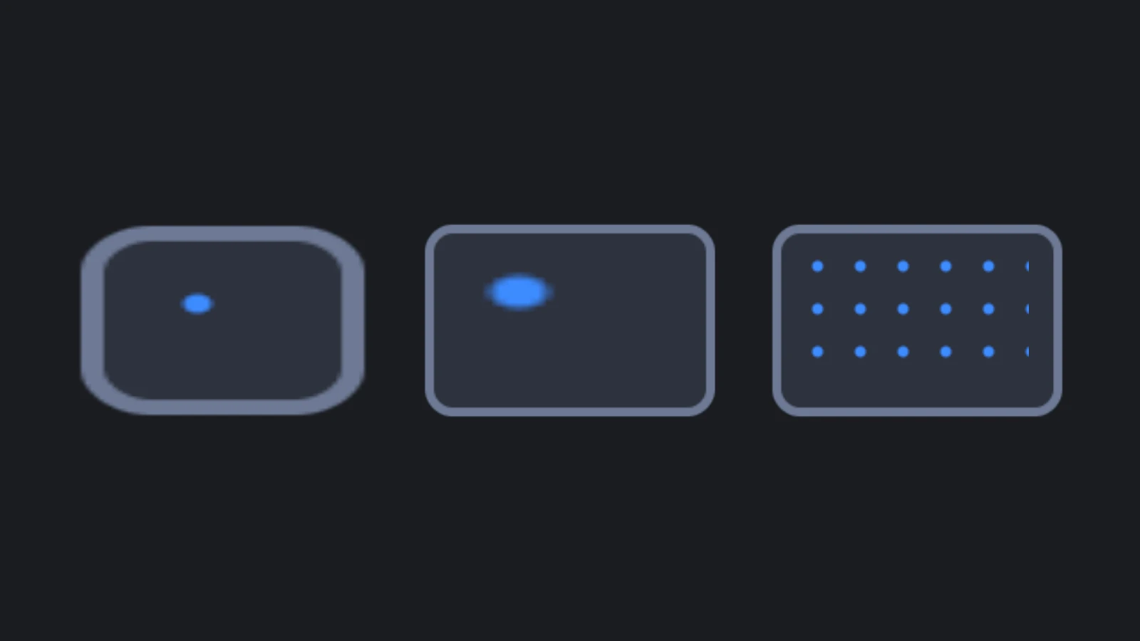
宽为 b 像素的边框对应 b / pixelsPerUnit 个屏幕单位。Pixels Per Unit 默认取精灵设置,图像元素可单独覆盖。因此每单位 1 像素时,16 像素边框宽 16 单位。元素尺寸不足以容纳两侧边框时,边框会缩小。
- 引擎
- 编辑器
- React
- Web Components
// A texture atlas with one 64 x 64 frame, whose 16 pixel borders keep their size
const atlas = new pc.TextureAtlas();
atlas.texture = panelTexture.resource;
atlas.frames = {
    panel: {
        rect: new pc.Vec4(0, 0, 64, 64),
        pivot: new pc.Vec2(0.5, 0.5),
        border: new pc.Vec4(16, 16, 16, 16)
    }
};
const sprite = new pc.Sprite(app.graphicsDevice, {
    atlas,
    frameKeys: ['panel'],
    pixelsPerUnit: 1,
    renderMode: pc.SPRITE_RENDERMODE_SLICED
});

const dialog = new pc.Entity('dialog');
dialog.addComponent('element', {
    type: pc.ELEMENTTYPE_IMAGE,
    anchor: [0.5, 0.5, 0.5, 0.5],
    pivot: [0.5, 0.5],
    width: 400,
    height: 240,
    sprite
});
screen.addChild(dialog);
帧的 rect 用纹理像素表示 X、Y、宽、高,以左下角为原点;border 顺序为左、下、右、上。使用精灵资源时,设置 spriteAsset 而非 sprite。
在精灵编辑器中设置帧边框,单击 New Sliced Sprite From Selection,再将新精灵资源拖到图像元素的 Sprite 字段。
useAsset 不加载纹理图集或精灵,因此需要从纹理创建:
import { useEffect, useState } from 'react';
import { SPRITE_RENDERMODE_SLICED, Sprite, TextureAtlas, Vec2, Vec4 } from 'playcanvas';
import { Entity } from '@playcanvas/react';
import { Element } from '@playcanvas/react/components';
import { useApp, useTexture } from '@playcanvas/react/hooks';

export function Dialog() {
  const app = useApp();
  const { asset: texture } = useTexture('textures/panel.png');
  const [sprite, setSprite] = useState(null);

  // A texture atlas with one 64 x 64 frame, whose 16 pixel borders keep their size. The sprite
  // owns meshes on the GPU, so it is created in an effect and destroyed with the dialog
  useEffect(() => {
    if (!texture) return;
    const atlas = new TextureAtlas();
    atlas.texture = texture.resource;
    atlas.frames = {
      panel: { rect: new Vec4(0, 0, 64, 64), pivot: new Vec2(0.5, 0.5), border: new Vec4(16, 16, 16, 16) }
    };
    const panelSprite = new Sprite(app.graphicsDevice, {
      atlas, frameKeys: ['panel'], pixelsPerUnit: 1, renderMode: SPRITE_RENDERMODE_SLICED
    });
    setSprite(panelSprite);
    return () => {
      setSprite(null);
      panelSprite.destroy();
    };
  }, [app, texture]);

  if (!sprite) return null;

  return (
    <Entity name="dialog">
      <Element type="image" anchor={[0.5, 0.5, 0.5, 0.5]} pivot={[0.5, 0.5]}
        width={400} height={240} sprite={sprite} />
    </Entity>
  );
}
<pc-asset id="panel-sheet" type="textureatlas" src="textures/panel.png"
          data='{"frames":{"panel":{"rect":[0,0,64,64],"pivot":[0.5,0.5],"border":[16,16,16,16]}}}'></pc-asset>
<pc-asset id="panel" type="sprite" atlas="panel-sheet" frame-keys="panel" render-mode="sliced"></pc-asset>

<pc-entity name="dialog">
    <pc-element type="image" anchor="0.5 0.5 0.5 0.5" pivot="0.5 0.5"
                width="400" height="240" sprite-asset="panel"></pc-element>
</pc-entity>
先声明纹理图集,再声明使用它的精灵,详见 <pc-asset>。
将三维内容渲染为图像
摄像机可以渲染到纹理,再由图像元素显示,适合角色头像、物品预览和小地图。为该摄像机分配独立图层,只包含它应看到的内容,并在主摄像机之前渲染:
// The texture to render into
const previewTexture = new pc.Texture(app.graphicsDevice, {
    width: 512,
    height: 512,
    format: pc.PIXELFORMAT_SRGBA8,
    mipmaps: false
});
const renderTarget = new pc.RenderTarget({
    colorBuffer: previewTexture,
    depth: true,
    origin: pc.RENDERTARGET_ORIGIN_TOP
});

// A layer for what the preview camera sees, which the main camera does not render
const previewLayer = new pc.Layer({ name: 'Preview' });
app.scene.layers.push(previewLayer);

const previewCamera = new pc.Entity('preview camera');
previewCamera.addComponent('camera', {
    layers: [previewLayer.id],
    renderTarget,
    priority: -1,
    clearColor: new pc.Color(0, 0, 0, 0)
});
previewCamera.setPosition(0, 0.5, 3);
previewCamera.lookAt(model.getPosition());
app.root.addChild(previewCamera);

// Put the model on the preview layer, and show the texture in the interface
model.render.layers = [previewLayer.id];
portrait.element.texture = previewTexture;
摄像机 priority 为 -1,先于默认优先级 0 的主摄像机渲染,确保绘制界面时纹理已就绪。透明清屏颜色使图像背景透明。应保留 sRGB 格式 pc.PIXELFORMAT_SRGBA8;使用 pc.PIXELFORMAT_RGBA8 会使图像过亮。将 origin 设为 pc.RENDERTARGET_ORIGIN_TOP,以图像纹理常用的首行在上的顺序存储,确保 WebGL2 和 WebGPU 均正向显示;否则 WebGL2 会倒置。origin 从引擎 2.22 起可用。
自定义材质
默认材质会使用图像元素的颜色、不透明度和纹理。需要渐变或着色器效果时,可将自定义材质赋给 material,或编辑器中的 Material。它会取代默认材质,包括默认材质处理元素颜色、不透明度及纹理的逻辑。
UI 图层仅绘制透明材质,因此材质必须启用混合才能显示:
const material = new pc.StandardMaterial();
material.useLighting = false;
material.emissive = new pc.Color(1, 0.55, 0.2);
material.blendType = pc.BLEND_NORMAL;
material.depthWrite = false;
material.update();

panel.element.material = material;
新材质默认不混合,这样的材质不会在 UI 图层绘制。屏幕空间材质应关闭光照,因为场景灯光对这种界面通常没有实际意义。
避免暗边
圆形图标等带透明区域的纹理,边缘可能出现细暗边或亮边。透明像素仍保留通常为黑色或白色的颜色,缩放时滤波会将这些颜色混入可见边缘。
应在图片中修复:用最近可见像素的颜色填充透明像素的 RGB,保持 Alpha 不变。很多图片编辑器和纹理工具提供此功能,常称为 Alpha 扩边、纹理填充或膨胀。
另请参阅
- 遮罩:按元素矩形或形状裁切子项。
- 按钮:悬停和按下时切换染色或精灵。
- 九宫格与精灵编辑器:创建精灵和边框。
- Element 组件、
<pc-element>和 ElementComponent:全部图像属性参考。