按钮
按钮组件将元素变为按钮,响应所属实体的元素输入,在悬停和按下时改变图像外观,并触发 click 等事件。元素需要启用输入。
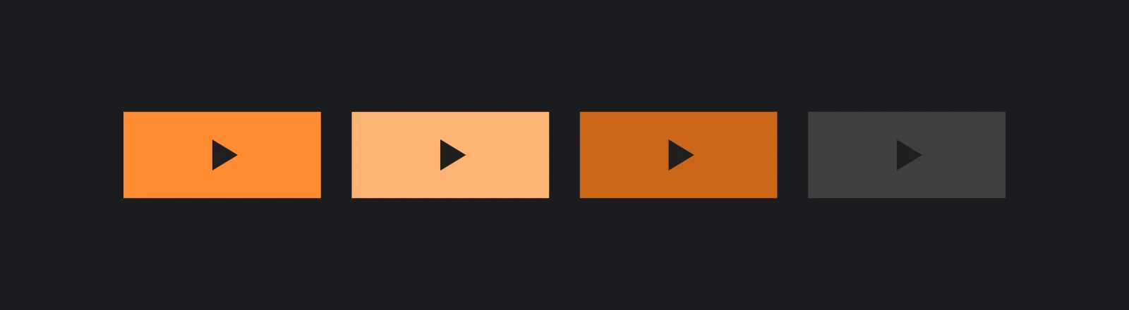
创建按钮
- 引擎
- 编辑器
- React
- Web Components
const button = new pc.Entity('button');
button.addComponent('element', {
    type: pc.ELEMENTTYPE_IMAGE,
    anchor: [0.5, 0.5, 0.5, 0.5],
    pivot: [0.5, 0.5],
    width: 200,
    height: 60,
    color: new pc.Color(1, 0.55, 0.2),
    useInput: true
});
button.addComponent('button', {
    imageEntity: button,
    hoverTint: new pc.Color(1, 0.7, 0.45),
    pressedTint: new pc.Color(0.8, 0.4, 0.1)
});
screen.addChild(button);

// The label is a child text element without input, so clicks on it go to the button
const buttonText = new pc.Entity('text');
buttonText.addComponent('element', {
    type: pc.ELEMENTTYPE_TEXT,
    fontAsset: font.id,
    text: 'Play',
    color: new pc.Color(0.1, 0.1, 0.1),
    anchor: [0.5, 0.5, 0.5, 0.5],
    pivot: [0.5, 0.5]
});
button.addChild(buttonText);

button.button.on('click', () => {
    console.log('Play');
});
创建应用时注册 pc.ButtonComponentSystem。
在层级中单击 +,选择 User Interface › Button。这会创建 Button 实体、已启用 Use Input 的图像元素、Image 指向自身的 Button 组件,以及 Text 子项。设置按钮尺寸、Color、Hover Tint、Pressed Tint 和子项文本。
这里使用第一个界面中的 Button 辅助组件,为所在实体添加引擎按钮组件,并在点击时调用 onClick。颜色原样传给引擎,因此染色值使用 playcanvas 的 Color 对象:
<Entity name="button">
  <Element type="image" anchor={[0.5, 0.5, 0.5, 0.5]} pivot={[0.5, 0.5]}
    width={200} height={60} color="#ff8c33" useInput />
  <Button hoverTint={new Color(1, 0.7, 0.45)} pressedTint={new Color(0.8, 0.4, 0.1)}
    onClick={() => console.log('Play')} />
  <Entity name="text">
    <Element type="text" fontAsset={font} text="Play" color="#1a1a1a"
      anchor={[0.5, 0.5, 0.5, 0.5]} pivot={[0.5, 0.5]} />
  </Entity>
</Entity>
<pc-entity name="button">
    <pc-element type="image" anchor="0.5 0.5 0.5 0.5" pivot="0.5 0.5"
                width="200" height="60" color="#ff8c33" use-input></pc-element>
    <pc-button hover-tint="1 0.7 0.45" pressed-tint="0.8 0.4 0.1"></pc-button>
    <pc-entity name="text">
        <pc-element type="text" font-asset="arial" text="Play" color="#1a1a1a"
                    anchor="0.5 0.5 0.5 0.5" pivot="0.5 0.5"></pc-element>
    </pc-entity>
</pc-entity>

<script type="module">
    import { whenReady } from '@playcanvas/web-components';

    const button = await whenReady('pc-button');
    button.component.on('click', () => console.log('Play'));
</script>
图像实体
按钮改变 image entity,即 imageEntity 上的一个图像元素。通常指自身,也可以是元素组背后的背景实体。输入来源不变:按钮始终响应自身实体的元素输入,包括启用输入的子项冒泡上来的事件。
编辑器 User Interface › Button 默认将图像实体设为自身;<pc-button> 同样如此,除非通过 image 指向其他实体。引擎中 imageEntity 默认为 null,未设置时仍触发事件,但外观不会变化。
过渡
按钮有默认、悬停、按下和未激活四种状态,Transition Mode 决定图像如何表现。
染色
默认 Tint 模式为各状态指定染色:
| 状态 | 属性 | 引擎默认值 |
|---|---|---|
| 默认 | 图像自身颜色与不透明度 | |
| 悬停 | hoverTint | 0.75, 0.75, 0.75 |
| 按下 | pressedTint | 0.5, 0.5, 0.5 |
| 未激活 | inactiveTint | 0.25, 0.25, 0.25 |
染色会替换图像颜色,而非相乘,因此默认灰色会将橙色按钮变灰。Alpha 也会变为图像不透明度,默认值为 1,因此半透明按钮悬停后会变为不透明。应选择按钮原色的浅色和深色版本,并设置所需 Alpha。
Fade Duration(fadeDuration)指定颜色过渡毫秒数,默认为 0,即立即切换。
精灵切换
Sprite Change 模式为每个状态指定独立资源和帧:hoverSpriteAsset、hoverSpriteFrame,pressedSpriteAsset、pressedSpriteFrame,以及 inactiveSpriteAsset、inactiveSpriteFrame。默认状态使用图像自身精灵,同一精灵的不同帧可通过一张纹理图集提供全部按钮状态。
引擎中设置 transitionMode 为 pc.BUTTON_TRANSITION_MODE_SPRITE_CHANGE,编辑器中将 Transition Mode 设为 Sprite Change,<pc-button> 上使用 transition-mode="sprite"。
事件
在按钮组件上监听事件:
| 事件 | 触发时机 |
|---|---|
click | 鼠标点击、触摸点击或 XR 选择 |
hoverstart, hoverend | 鼠标或 XR 控制器开始/结束悬停 |
pressedstart, pressedend | 任意输入开始/结束按下 |
mouseenter, mouseleave, mousedown, mouseup | 所属元素的鼠标事件 |
touchstart, touchend, touchleave, touchcancel | 所属元素的触摸事件 |
selectstart, selectend, selectenter, selectleave | 所属元素的 XR 选择事件 |
输入事件接收与元素自身事件相同的对象,各开发方式的监听位置详见监听事件。
button.button.on('pressedstart', () => {
    button.setLocalScale(0.95, 0.95, 1);
});
button.button.on('pressedend', () => {
    button.setLocalScale(1, 1, 1);
});
按下后移出按钮会结束按下状态,在按钮外释放不会触发点击。
命中扩展
Hit Padding(hitPadding)以屏幕单位扩大按钮接收输入的区域,顺序为左、下、右、上。不改变外观,也能让小按钮更易点击:
// Make a 32 × 32 close button react 16 units around it
closeButton.button.hitPadding = new pc.Vec4(16, 16, 16, 16);
禁用按钮
将 active 设为 false,按钮显示未激活颜色或精灵,不再触发按钮事件。但元素仍接收输入并触发自身事件,也仍会拦住原本到达后方元素的点击。要让输入穿透,还需关闭元素 useInput;要隐藏则禁用实体。
buyButton.button.active = coins >= price;
触摸与 XR
- 触摸。 没有悬停状态,点击会从默认变为按下再返回。按钮在
touchend取消浏览器模拟鼠标事件,避免误入悬停状态。若在click中立即隐藏自身,将错过touchend,使模拟事件传到后方对象。修复方法详见触摸屏。 - XR。 控制器或手指向按钮时进入悬停,选择操作会按下并点击,详见 XR 界面。
声音与光标
按钮不自带声音或光标。可在 click 中通过按钮上的声音组件播放音效,并在悬停时修改光标:
button.button.on('hoverstart', () => {
    app.graphicsDevice.canvas.style.cursor = 'pointer';
});
button.button.on('hoverend', () => {
    app.graphicsDevice.canvas.style.cursor = '';
});
另请参阅
- 输入:事件、冒泡和隔离游戏点击。
- 常用控件:使用按钮构建开关、单选组和对话框等。
- 用户界面:按钮:在编辑器中构建染色和精灵按钮。
- Button 组件、
<pc-button>和 ButtonComponent:全部按钮属性参考。